Read clearly at a distance
Brand details need to remain recognisable when the trailer is moving or viewed from across the road.
ResponseGive the company name and eagle a prominent scale, supported by bold contrast and uncluttered space.
A high-impact trailer livery that pairs Smith Transport’s eagle identity with bold movement, confident colour and a clear brand message.
Explore the design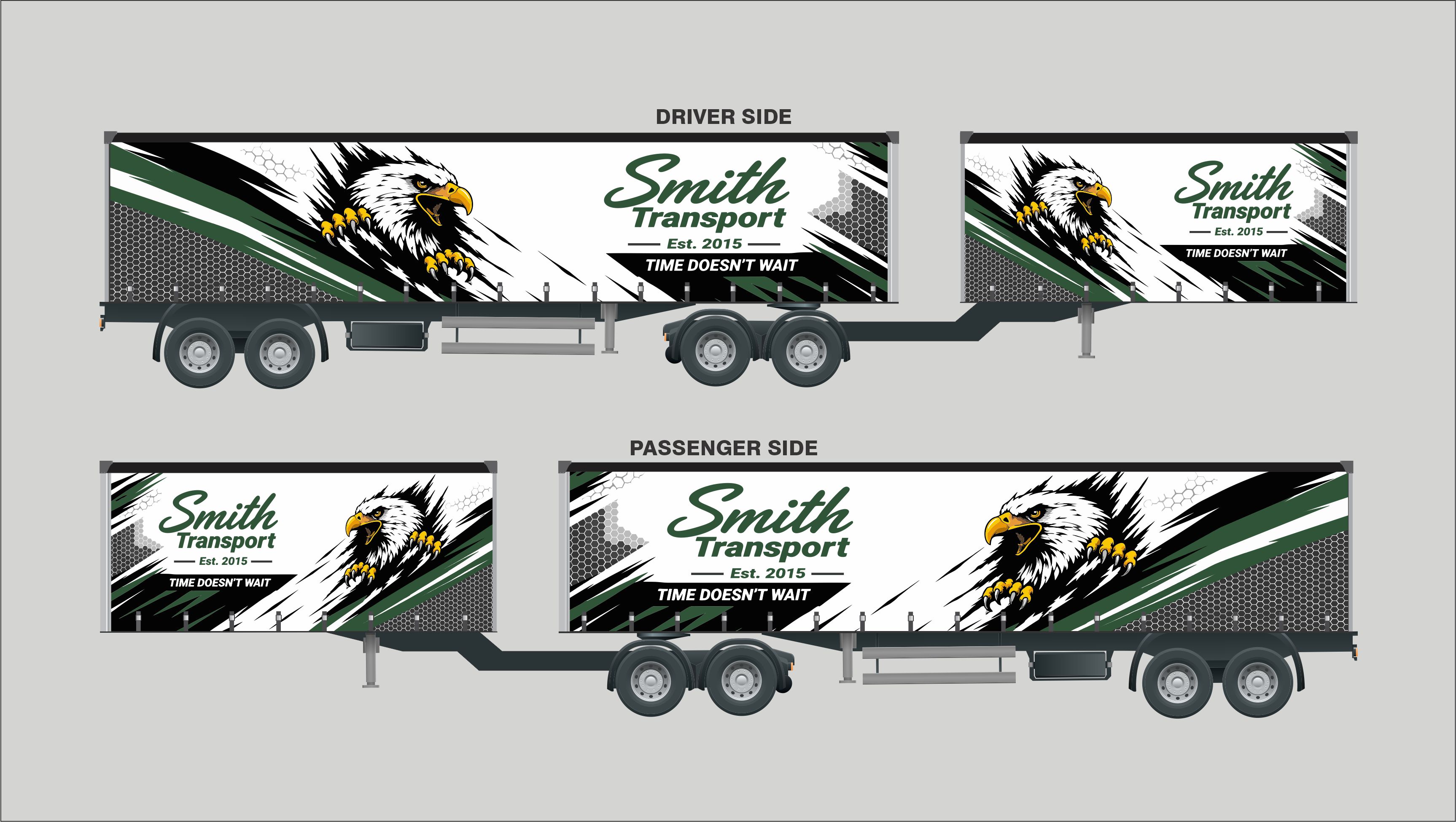
Smith Transport
Trailer wrap · Fleet graphics
The brief was to turn Smith Transport’s trailer sides into a strong, recognisable brand presence on the road.
The design brings together the company name, eagle emblem and “Time doesn’t wait” message in a high-contrast composition. Black, white and deep green create a distinctive fleet identity, while the artwork is adapted to both 6-metre and 12-metre trailer layouts.
Directional graphics carry energy across the long vehicle sides and help the main brand elements read clearly at scale.
Brand details need to remain recognisable when the trailer is moving or viewed from across the road.
A static layout should still convey the speed and forward momentum of a transport business.
Large vehicle sides need a deliberate relationship between the emblem, business name and supporting message.
The graphic system needs to work on both 6-metre and 12-metre trailer applications.
The fleet graphics extend Smith Transport’s identity across two trailer sizes with a consistent, high-visibility visual system.
The eagle, wordmark and colour palette work together as a distinctive transport identity.
Clear brand and tagline placement supports quick recognition on the road.
Directional graphics add energy and guide the eye across the trailer sides.
The visual system carries across both 6-metre and 12-metre layouts.
“The eagle and sharp green graphics give our trailers a strong presence. The design carries the Smith Transport name clearly across the fleet.”